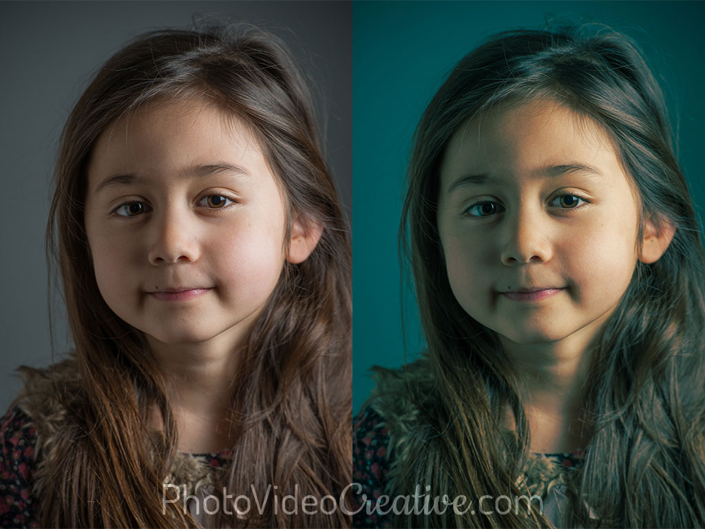
Purists call it a split toning or color grading. The millenial followers of Instagram, Facebook or Snapchat simply call it photo filter. But do you know the secret of these “filters”? Why do photo filters stir our curiosity? How can you create your own photo filter? Part of the answer lies in developing a color palette in your photo and the emotions it creates.
I will share with you:
- what is a color palette and harmony
- the link between color palette and emotions
- how to choose the colors of a palette
- how does a color palette apply to a photo
- which photo editing tools allow the development of a color palette
Before We Begin
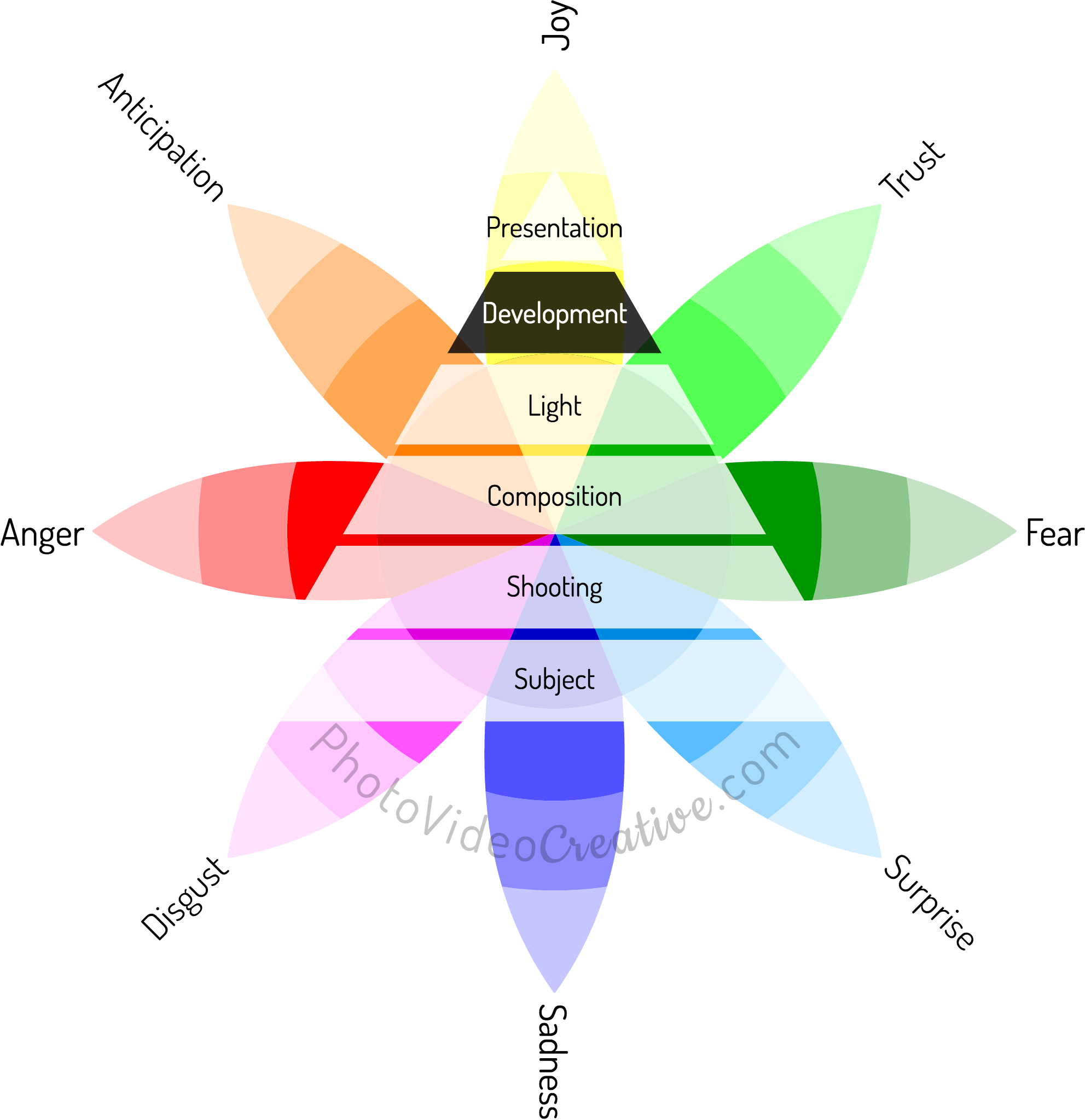
Succeeding in making remarkable photos means making photos that provoke emotions that are most faithful to the emotions you felt when shooting. Focused on the theory of emotions, I designed a 6-step method for learning photography first with what you feel. Development is the 5th step to achieving it, and mastering color is one of the 6 essential development techniques to be known in photography.
The Color Palette: A Harmonious Simplification Of The Color Range
Technically, the “good” colors of a photo have the same hues as you see with your own eyes. But from a creative point of view, the “good” colors can also be more or less out of sync with reality. By slightly changing the hue of certain colors in your photo, you can merge different colors from the photographed scene to a smaller palette of hues. This reinforces the coherence of the colors of your photo which helps to give it a style and make it special. But provided that this palette is composed of harmonious colors.
A Quick Reminder About The Theory of Emotions
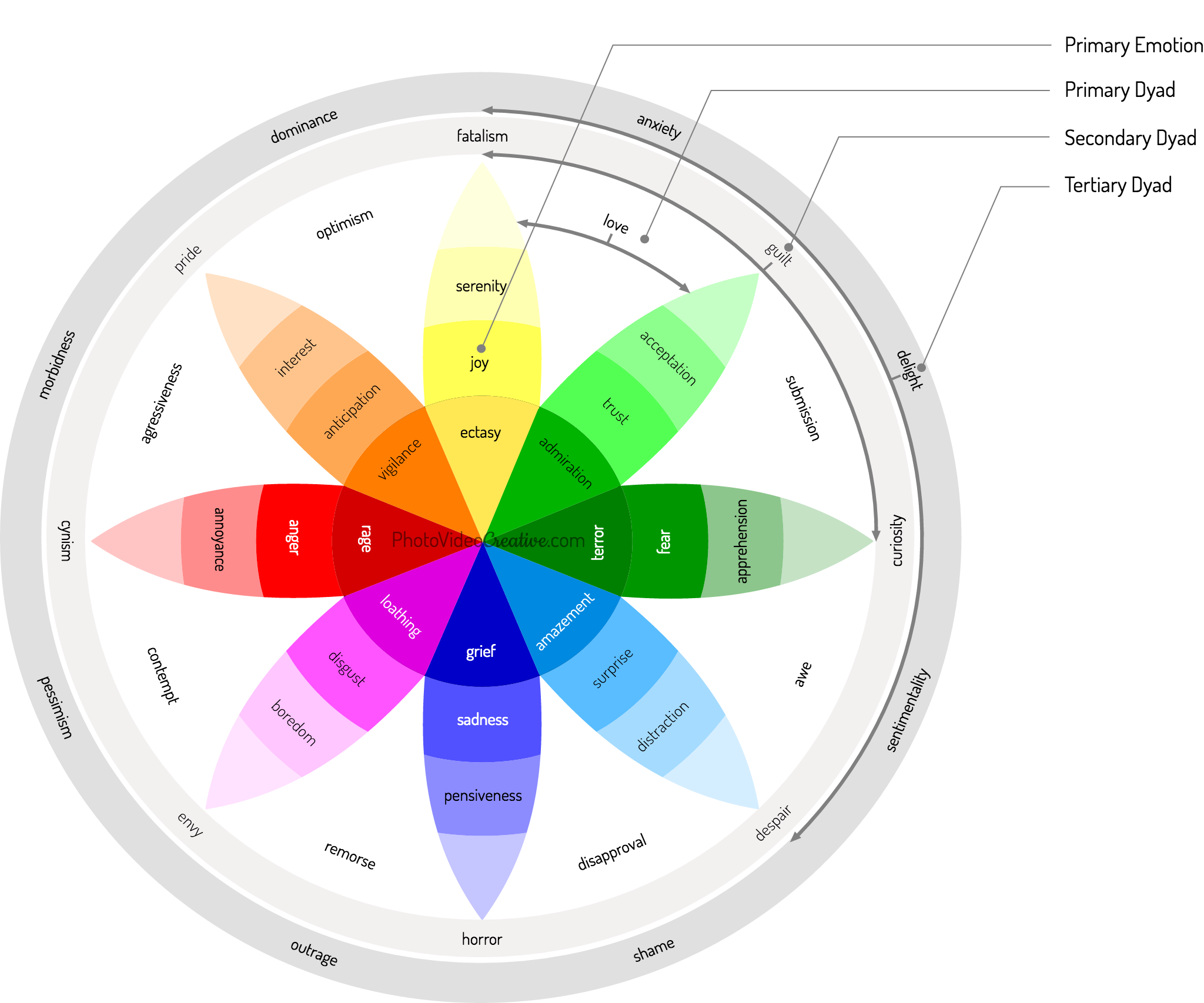
All types of emotions that we feel can be represented on a wheel with 8 primary emotions according to the theory of emotions of Plutchik. These primary emotions come in varying intensities (the most intense are at the center) and combine in 24 other emotions through dyads.
Emotions and The Color Palette
Styling your photo with color makes it more intriguing and more desirable. Like the composition, a color palette aims to draw the eye in your photo. This is because the colors do not seem quite exact nor normal, but their shades appear nevertheless harmonious that you make your photo both credible and offbeat. You create a color tension on the likelihood and improbability of your photo. You pull the observer in your universe so that he feels as close as possible the emotions you have captured in front of your subject. In the art of story telling, this is called the suspension of disbelief!
Making emotions more present is to reinforce their intensity. Referring to the wheel of emotions, it brings out the emotions at the center of the wheel:
- Ecstasy,
- Admiration,
- Terror,
- Amazement,
- Grief,
- Loathing,
- Rage,
- Vigilance.
How To Choose The Right Color Palette
A color palette is defined by a deliberately small number of colors but which are in harmony. There can be 2, 3, 4, 5 colors or even more. The harmony of the colors is described with the color wheel and the theory of the colors: complementary colors, analogous/adjacent, triads, … I invite you to experiment the dynamics of color harmonies with free online tools like Adobe Color.
How to start? It is the dominant colors of your subject that must guide the palette to have:
- For a portrait, it’s the skin tones of the face
- For a forest landscape, it’s the colors of the foliage: green in spring, yellow in autumn
- For a seascape, it’s the colors of the sea
- For an architectural landmark, it’s the color of the sky or as fallback the lighting
- Etc.
The dominant colors should be the reference colors that will be the visual anchor to keep the likelihood of your photo. It will be the other colors in your photo that will play in your creative palette.
How to complete your palette? The easiest way is to start with a palette with 2 complementary colors: blue/orange, green/magenta, etc. Take the dominant color of your subject, and find the associated complementary color:
- For a portrait, it will be a bluish color
- For a forest landscape with green foliage, it will be a red/magenta color
- For a seascape with blue hues, it will be a yellow/orange color
- For a mountain lit by a rising sun, it will be a blue color
- Etc.
But your palette can also be more complex, and play on triads or shades of similar colors for example.
How To Apply A Color Palette To Your Photo
There are many techniques for applying a stylized color palette to a photo. These techniques can be called split toning, or color grading in particular. But the principles of these techniques are essentially the same: we introduce colored shades for dark, medium and / or light areas to the entire image, or only on the subject and/or its environment. This can be a global effect or a selective/local effect (the colorists in the movie industry talk about primary and secondary color adjustments).
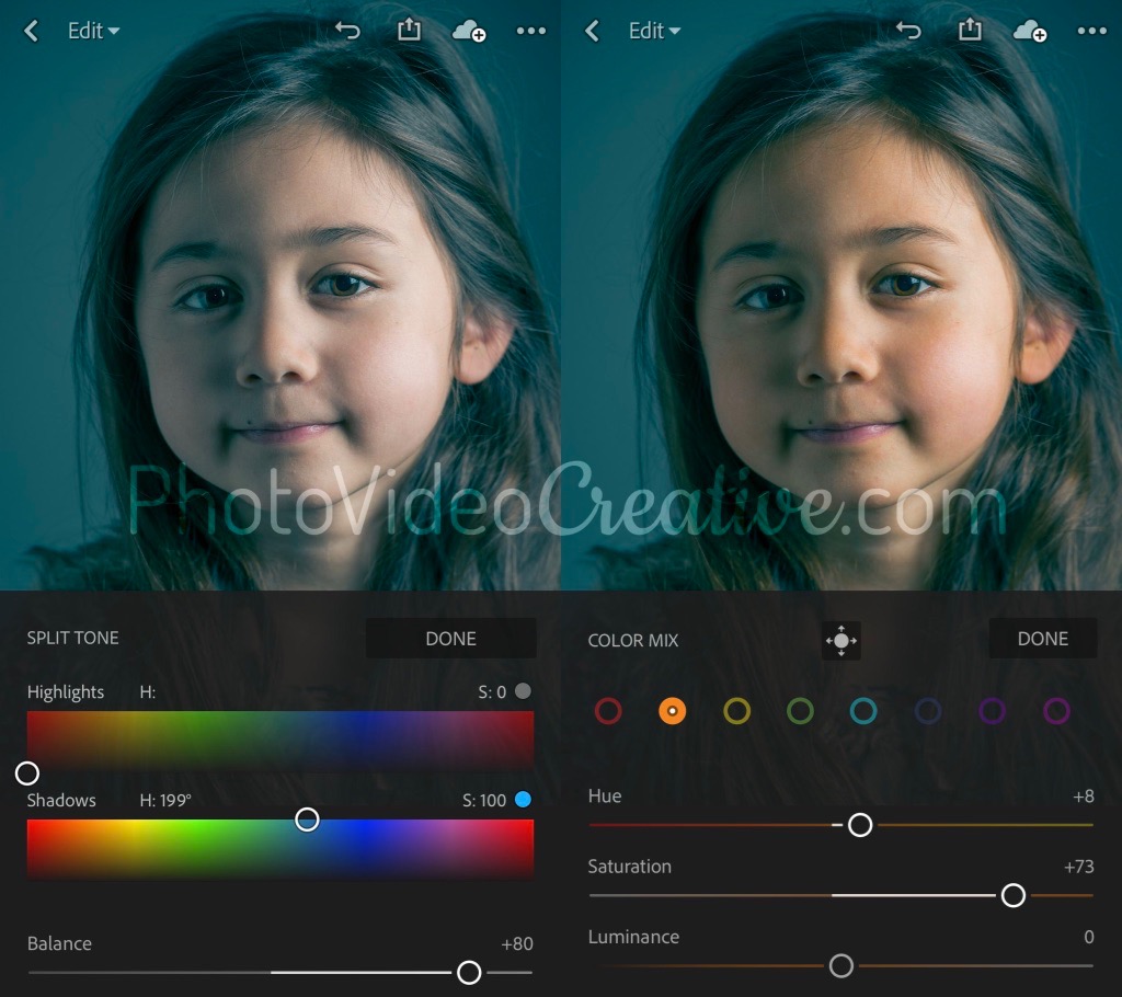
For example, for a portrait photo, you can apply a stylized palette to the subject and tint the shadows in blue and strengthen the middle tones of the face in yellow/orange. We thus play on the complementary harmony of these two colors, while keeping the skin tones of the face plausible and pleasing.

Tools To Develop A Color Palette In Your Photo
Without going into a step-by-step tutorial that goes beyond the scope of this article, I can refer you to some tools to experiment with this technique.
The easiest way is to use mobile apps on smartphone or tablet. Many very popular applications like Instagram or VSCO offer editing features for color palette, but the result is often (very) disappointing: it is very difficult to effectively protect the dominant colors of your subject. One of the few applications that gives honorable results is Adobe Lightroom CC for Mobile, even in its free version!
On Mac / desktop PC, the choice is great and the possibilities endless, but you have to pay to have effective tools. We can cite :
- Affinity Photo, which in the color palette application area is almost as powerful as Adobe Photoshop for a fraction of the price
- Adobe Lightroom Classic, which compared to the mobile version, offers a color calibration feature that can be used for creative purposes
- and of course Adobe Photoshop which offers the ultimate level of sophistication for this kind of development.
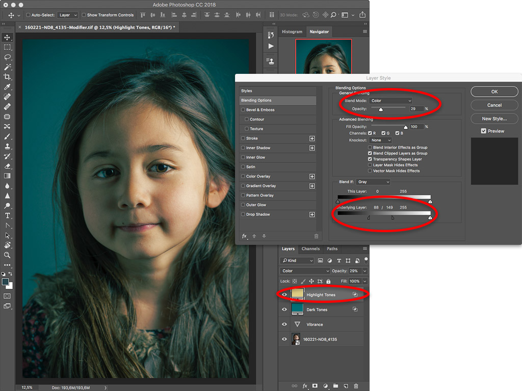
I mentioned at the beginning of my post the example of “photo filters” in mobile applications. The color palette is the main component of those filters. But these filters also use other development techniques:
- Tonality development, often with the use of vignetting
- Contrast development
If you know these techniques, you will do better than any filter on the market!
Let’s Go On Together!
Learn how to photograph with my 6-step method to make your photos first with your emotions. An intuitive approach that focus on what you are feeling, before considering any tools and techniques!
Then understand why development in photography is essential in the expression of your emotions and explore the 5 different techniques of color development:
- Color of ambient light: developing the white balance
- Intensity of colors: developing color saturation
- Attracting to your subject with color: developing selective/local saturation
- Harmony of colors: developing a color palette (this post)
- Monochrome tones: developing in black and white
Do not miss my future posts to better capture and share your emotions in picture: subscribe to my newsletter and get my free eBook!
Do you like what you’ve learned? Share this article with your loved ones!