Why do colors with dull saturation or intense saturation cause different emotions? How can you develop your photo with the right saturation using a retouching photo application on your computer or your smartphone?
I will share with you:
- How colors are decomposed and what color intensity means with saturation
- A reminder of the theory of emotions
- The emotions related to saturated and desaturated colors
- The tools and applications for developing saturation
Before We Begin
Succeeding in making remarkable photos means successfully capturing and sharing emotions in your photos. Focused on the theory of emotions, I designed a 6-step method for learning photography first with what you feel. Development is the 5th step to achieving it, and mastering color is one of the 6 essential development techniques to be known in photography.

Develop Color Intensity With Saturation

In color theory, a color can be defined with 3 components:
- its hue or tint: red, green, blue, yellow, …
- its saturation: greyish color or very intense color
- its luminosity: light color or dark color
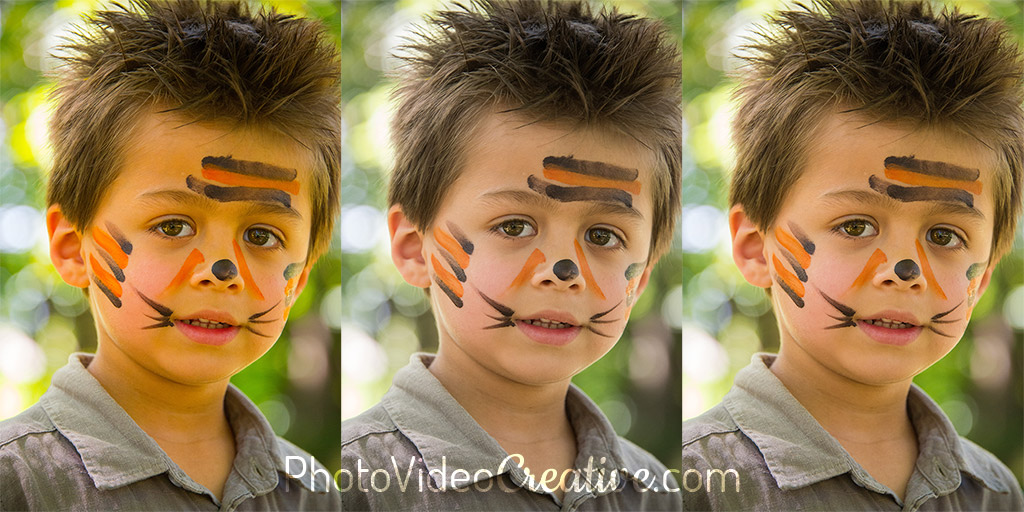
In nature, intense and luminous colors attract our eye more than others. You can play with the saturation of colors, or the lack of saturation of your photo to reinforce the emotions that you want to share.
From a technical point of view, the “good” saturation is that which remains true to the intensity of colors that you see directly. But a faithful saturation will not especially emphasize any emotions of your photo through colors.
From a creative point of view, the “good” saturation is the one that will push to the maximum or to the minimum the intensity of colors to support the emotions of your photo.
A Quick Reminder About The Theory of Emotions
All types of emotions that we feel can be represented on a wheel with 8 primary emotions according to the theory of emotions of Plutchik. These primary emotions come in varying intensities (the most intense are at the center) and combine in 24 other emotions.

Emotions Related To Saturated Colors
When the color saturation of your photo is increased, the following emotions are most often supported:
- joy, love (joy + confidence)
- optimism (joy + anticipation)
- delight (joy + surprise)
These are generally positive emotions.
More broadly, increasing color saturation is a way to reinforce the intensity of primary emotions, those that are at the center in the wheel of emotions.
Emotions Related To Desaturated Colors
On the contrary, when the saturation of the colors of your photo is diminished, the following emotions will be supported:
Or emotions much more negative:
- remorse (sadness + disgust), despair (sadness + fear), insipidity (sadness + confidence)
- fatalism (anticipation + confidence), aggressiveness (anticipation + anger), pessimism (anticipation + sadness)
- morbidity (joy + disgust)
- indignation (surprise + anger)
- shame (fear + disgust)
For photos of family or friends, these emotions are of course not really sought after. Nevertheless, for more personal photographs such as travel, street, landscape or artistic photography, these are emotions that can cross you and that you want to capture. The decrease in saturation then helps to share them more strongly in your photo.
Tools to Develop Color Saturation
Any photo editing application on computer or smartphone offers you to develop color saturation. With brightness or contrast, it is a setting that is part of the development basics and as old as the good old color television! However, there are often 2 saturation features that can be found in photo retouching applications:
- the “classic” saturation
- the smart saturation often called “vibrance”
The “classic” saturation will touch all the colors of the photo, whatever their color and intensity.
The vibrance will touch the colors that have a low to medium intensity; the already well-saturated colors will see little variation in their intensity. Vibrance is thus a more subtle setting, as the over-saturation or over-desaturation of intense colors are avoided. In some applications, the vibrance also protect the skin tone colors to avoid any artificial rendering of the face.
The use of color saturation can then be done in 2 steps:
- Develop the classic saturation to find the right level of color intensity without going to your target, then
- Develop vibrance to continue pushing the intensity of the colors to your desired threshold
By doing so, you will be able to saturate the colors powerfully but not over-played. Like any development adjustment, the right dosage should be noticeable without taking over on your subject. If you first notice the saturation effect before you even look at the subject, you can tell immediately that development has failed.
Let’s Go On Together!
Learn how to photograph with my 6-step method to make your photos first with your emotions. An intuitive approach that focus on what you are feeling, before considering any tools and techniques!
Then understand why development in photography is essential in the expression of your emotions and explore the 5 different techniques of color development:
- Color of ambient light: developing the white balance
- Intensity of colors: developing color saturation (this post)
- Attracting to your subject with color: developing selective/local saturation
- Harmony of colors: developing a color palette
- Monochrome tones: developing in black and white
Do not miss my future posts to better capture and share your emotions in picture: subscribe to my newsletter and get my free eBook!
Do you like what you’ve learned? Share this article with your loved ones!