
There is no ideal contrast. Many novice photographers believe that a good photo is a picture with a strong contrast with “all sliders pushed all way through”!
But there is no good or bad contrast in the absolute. The right contrast is the one that intensifies faithfully your emotions! And putting the contrast to the maximum can be at best excessive, at worst an emotional counter-sense.
I will share with you:
- What is the contrast of a photo
- The special case of micro-contrast
- A reminder about the theory of emotions
- Emotions related to a high contrast photo
- Emotions related to a low contrast photo
- How to apply and control the contrast of your photo
Before We Begin
Succeeding in making remarkable photos means successfully capturing and sharing emotions in your photos. Focused on the theory of emotions, I designed a 6-step method for learning photography first with what you feel. Development is the 5th step to achieve, and mastering contrast is one of the 6 essential development techniques to be known in photography.

What Is The Contrast Of A Photo?
The contrast of a photo is the difference in brightness between the dark tones and the light tones of the image. The more a picture is contrasted, the more the dark tones tend towards black, and the more the light tones tend towards white. Conversely, a low-contrast photo gives an image where dark tones and light tones are not very differentiated. For example, the darkest tones will have a brightness equivalent to a medium gray, and the lighter tones will have brightness equivalent to a light gray.
The contrast should not be confused with the tonality of a photo. Contrast plays in two opposite directions for dark and light tones, while tonality plays in a single direction. When moving towards high key tonality, dark tones and light tones become brighter together. While when tending towards a high contrast, only the light tones become brighter, but the dark tones darken.
The Special Case Of Micro-Contrast: The Clarity
When we talk about the contrast of a photo, we are actually talking about the contrast that applies to the entire image: it’s the global contrast. When the contrast varies, it is all the dark tones of the image that are affected on the one hand, and all the light tones on the other hand.
But there is also the local contrast: it’s the micro-contrast. The micro-contrast applies itself contextually by analyzing the pixels relative to each other. In development / retouching applications, the micro-contrast is very often called clarity. Clarity will increase or decrease the difference in brightness of dark tones and light tones of textures. As clarity increases, the texture details are emphasized. As clarity decreases, the texture details are smoothed out.

Contrast And Emotions
From a technical point of view, a well-contrasted photo is a photo that will most faithfully reproduce the differences in brightness of the subject and its environment as seen directly.
But what is the point of contrast for a photo? When we look around us, our eye is attracted by local variations in brightness. To be convinced, we can better distinguish our environment in sunny weather, than when there is fog. Having a good contrast photo is also having an image immediately understandable for our vision.
But to have a “faithful and ready-to-look” rendering of the contrast is often too neutral compared to the emotions that you felt and that you want to share with your photo. Therefore from a creative point of view, your contrast must be reinforced or diminished precisely to intensify your emotions.
A Quick Reminder About The Theory of Emotions
All types of emotions that we feel can be represented on a wheel with 8 primary emotions according to the theory of emotions of Plutchik. These primary emotions come in varying intensities (the most intense are at the center) and combine in 24 other emotions through dyads.

Emotions Related To High Contrast
If you choose a global high contrast in your photo, you will bring out the following rather masculine emotions:
- Anticipation or even Vigilance
- Anger or Rage
- Pride (Anger + Joy), Domination (Anger + Trust), Aggressiveness (Anger + Anticipation)
Or even negative emotions like:
- Fear or Terror
- Sadness or Grief
- Disgust or Loathing
- Anxiety (Fear + Anticipation), Awe (Fear + Surprise), Submission (Fear + Trust)
- Fatalism (Anticipation + Trust), Cynicism (Anticipation + Disgust), Pessimism (Anticipation + Sadness)
- Remorse (Sadness + Disgust), Despair (Sadness + Fear), Disapproval (Sadness + Surprise)
- Horror (Disgust + Surprise), Morbidity (Disgust + Joy), Contempt (Disgust + Anger), Shame (Disgust + Fear)
- Outrage (Anger + Surprise)
Similarly, a reinforced micro-contrast can elicit the same emotions as the global contrast. But it can also cause the following emotions:
So you see that the contrast enhancement has very powerful effects on the emotions that must be properly tuned.
Emotions Related To Low Contrast
With a global low contrast of your photo, the emotions you can provoke are quite positive:
- Joy
- Trust
- Pensiveness
- Optimism (Joy + Anticipation), Love (Joy + Confidence)
But it can also denote rather moody emotions like:
- Sadness
- Faded (Sadness + Confidence), Envy (Sadness + Anger)
When you lower the micro-contrast of your photo, the effect looks like a blurry filter applied to the image. The emotions are equivalent to those of a global low contrast.
How To Apply The Contrast To Your Photo
Global contrast is one of the most common photo development/editing settings with saturation and brightness. So what photo development/photo editing tools to use? There are many, but some of the best known are Adobe Lightroom and Google Snapseed.
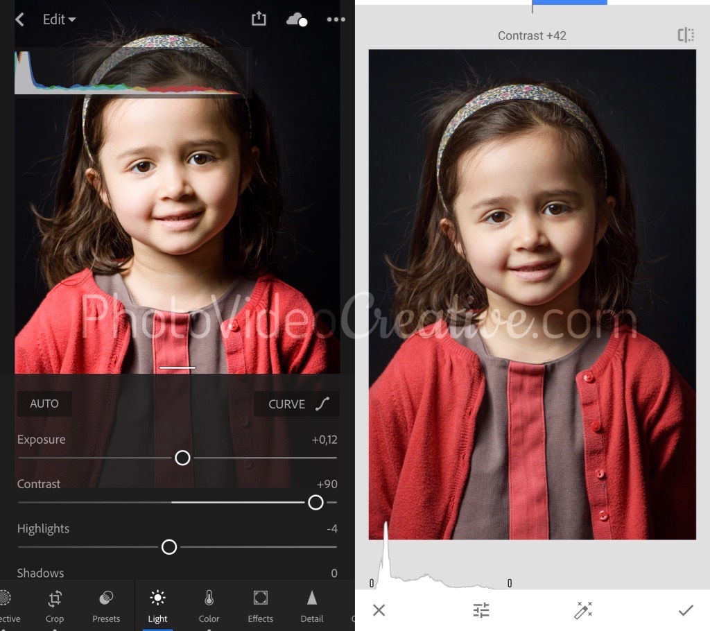
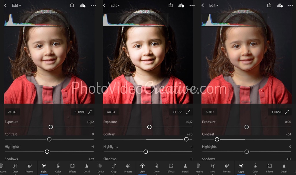
In its simplest form, contrast is a slider that is increased or decreased.
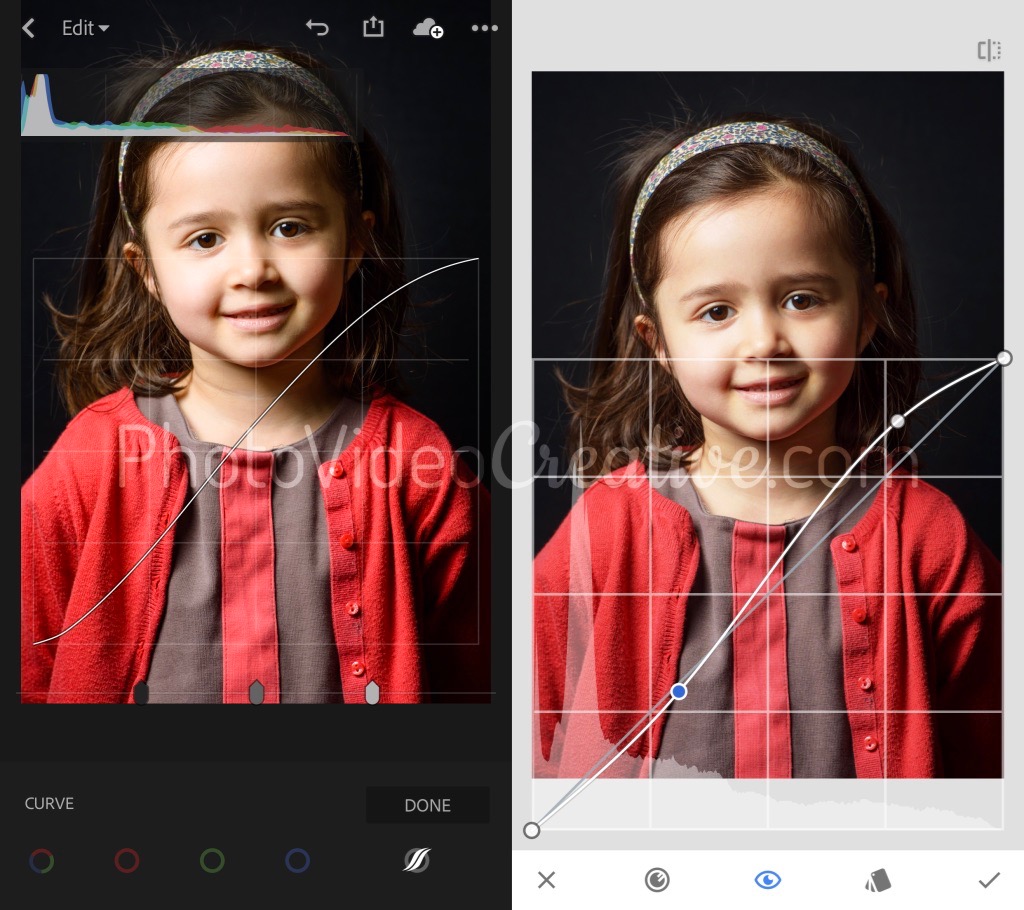
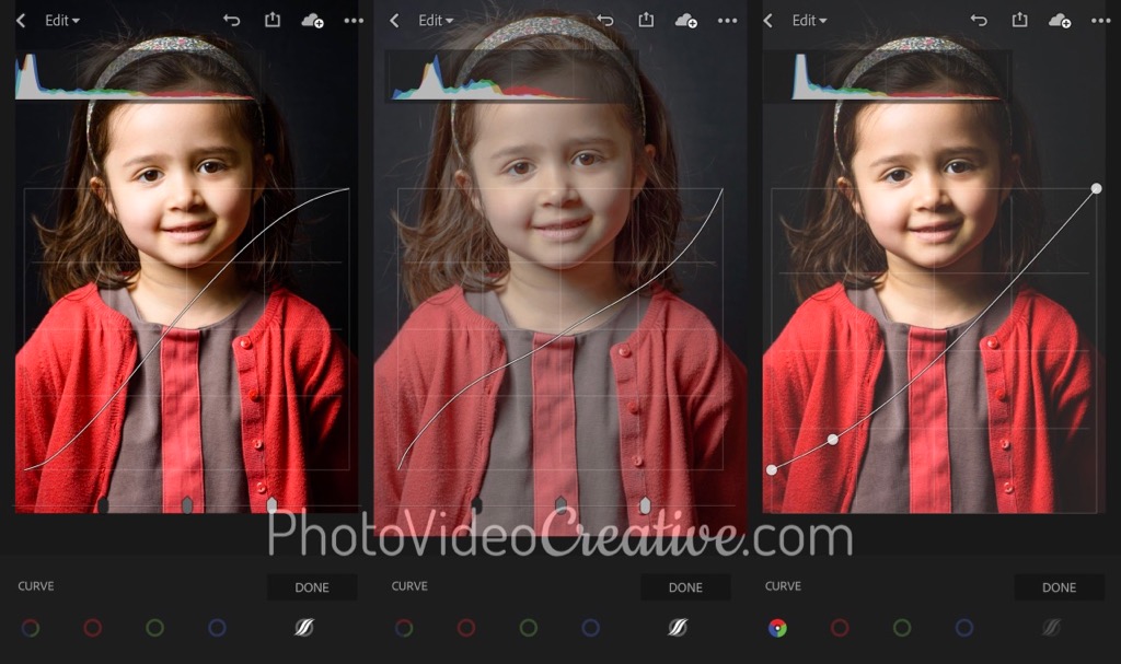
In its more expert form, you can set the contrast more finely with the tonal curve. With this curve you will be able to precisely target the range of tones and its intensity of darkening or lightening. To increase the contrast, the curve will have the shape of a stretched “S”. To decrease the contrast, the curve will have an inverted shape.
In addition, the tonal curve provides additional adjustment so that the darkest tones can be brightened and/or the lighter tones be less white. This technique is complementary to the overall decrease in contrast. We find this type of contrast in the filters of popular photo applications like Instagram. This gives a retro/vintage look that goes quite in the direction of the emotions with attenuated contrast.
Like all development tools, you must sufficiently push downward or upward the contrast to make it intentional, but never noticed before your subject. If you only see the artifice, all the emotional messages you were trying to convey will be lost.
How To Control The Contrast During Development
Rather than adjusting the contrast of your photo by controlling the result with your eyes only, the safest way is to develop is to check the image histogram. If not, you risk applying a too violent contrast that will make too white and/or too black the tones of your photo.
As a reminder, the histogram shows the amount of pixels in the image for each brightness level. Having a contrasted image is to have a histogram where the pixels are pushed to the extreme left and extreme right of the graph. For a low-contrast photo, the histogram shows pixels that are gathered on the central area of the graph.
Let’s Go On Together!
Learn how to photograph with my 6-step method to make your photos first with your emotions. An intuitive approach that focus on what you are feeling, before considering any tools and techniques!
Then understand why development in photography is essential in the expression of your emotions and explore the different development techniques:
- The development by Cropping
- The development of Tonality
- The development of Color
- The development of Contrast (this post)
- The development of Geometry
- The development of Pixel Rendering (soon)
Do not miss my future posts to better capture and share your emotions in picture: subscribe to my newsletter and get a free eBook!
Do you like what you’ve learned? Share this article with your loved ones!