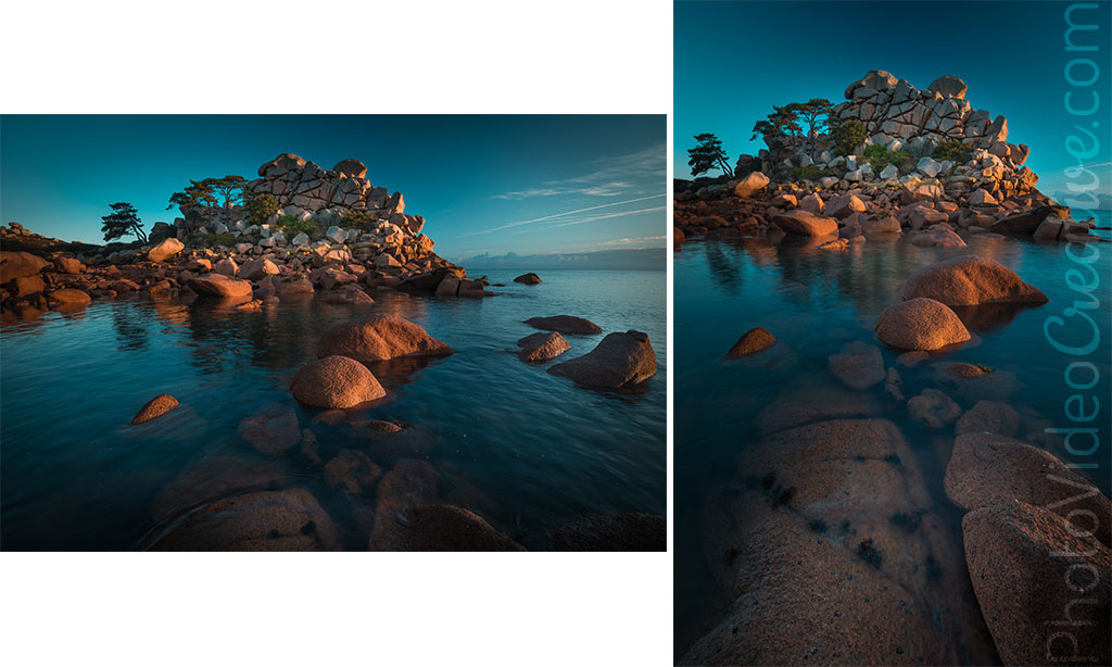
Why do you have to compose a portrait photo with a portrait orientation and a landscape photo with a landscape orientation? Where does this composition rule come from? When and why should it be transgressed? How to make a great photo by choosing this or that orientation? What should only guide you are the emotions that you feel and want to capture in a photo!
I will share with you:
- What is the composition with a natural orientation
- A reminder about composition
- Why framing with an orientation in opposition to the subject
- An introduction to the theory of emotions
- Emotions related to a natural orientation and an opposite orientation
Before We Begin
Succeeding in making remarkable photos means successfully capturing and sharing emotions in your photos. Focused on the theory of emotions, I designed a 6-step method for learning photography first with what you feel. Composition is the 3rd step to achieve, and mastering photo orientation is one of the essential composition techniques you should know in photography.
Composition With A Natural Orientation: What Is It?
Before the photography era, the dominant art for creating images was painting. Classical painting has always used many formats for:
- The aspect ratio: from 1: 1 square format to more or less elongated rectangular format
- The orientation of the image: vertical orientation called “portrait” or horizontal orientation called “landscape”
The photography continued in the footsteps of painting and offered the same richness of formats in aspect ratios and orientations.
The name of each of these orientations is already significant. We are supposed to do:
- A portrait photo in “portrait orientation”, and
- A landscape photo in “landscape orientation”
This stems from our natural visual experience. When we look at a person, our vision focuses on her and instinctively excludes everything around her. When we look at a landscape, our field of vision opens up to capture everything that is in front of us.
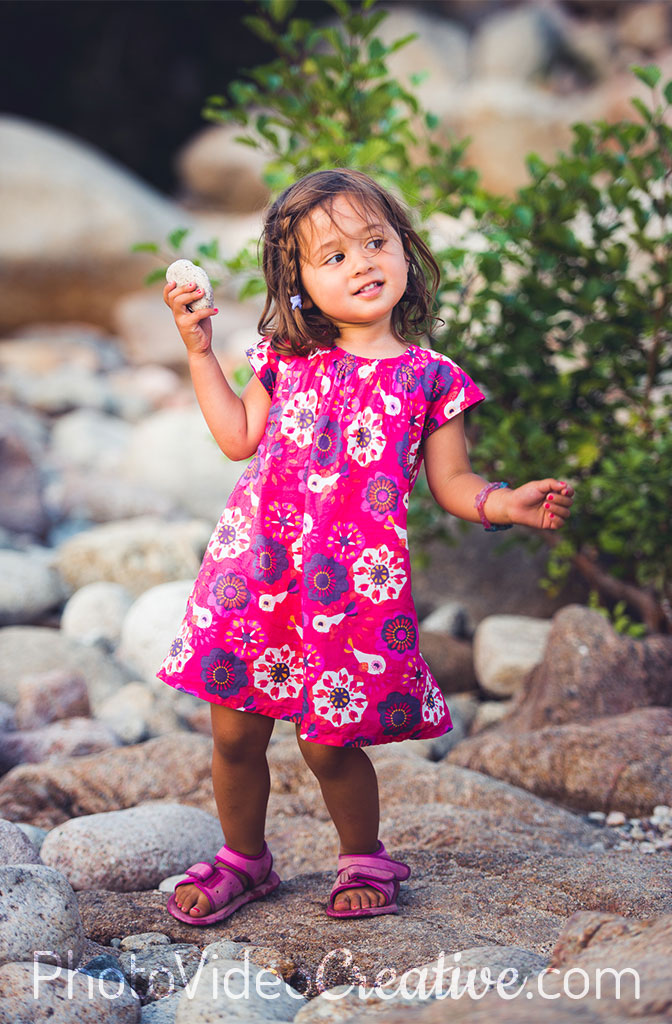
With a portrait-oriented photo, vertical subjects such as a person or their face fit naturally within the vertical frame of the image. The long edges of the image give the visual sensation of compression and elongation: the subject is clearly put forward. The composition of the photo fits our natural visual experience.
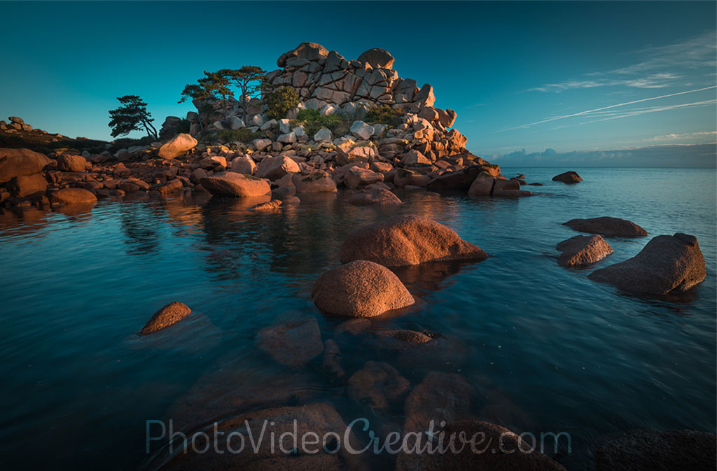
Likewise, with a landscape-oriented photo, horizontal subjects like a landscape can be captured in their full-length: this mimics their full extent in our visual field. Here too, the long edges of the image compress the subject and accentuate the visual effect of spreading: the subject is put forward. The composition is inline with our natural visual experience.
But the choice of the orientation of your photo should not ignore the possibility of composing a portrait in landscape orientation, or a landscape in portrait orientation. The real question is not to choose between landscape or portrait orientation, but between natural or opposite orientation to your subject.
If the emotions carried by the subject, the shooting, the light are already very present, a composition with a natural orientation is quite justified. It would be difficult to imagine the picture of the Mona Lisa in landscape orientation for example!
However, keeping a natural framing of your subject does not necessarily make a great composition.
A Brief Reminder About Composition
Composition is about organizing the content of your photo. It means choosing:
- Where to stand in front of your subject, and
- How to place your subject in the frame of the image.
The goal is twofold, it is necessary that:
- The eye is hooked by the photo and has an irresistible desire to wander in it,
- By being captivated by the form, we become more sensitive to the content of the photo with your subject and your emotions
On this blog, you can find the techniques of composition and their effects on emotions.
Why Frame Your Photo With An Orientation Opposite To That Of Your Subject
Everything out of the ordinary challenges us. By choosing an orientation of your photo that goes against your natural field of vision, you force the eye to linger over your subject.
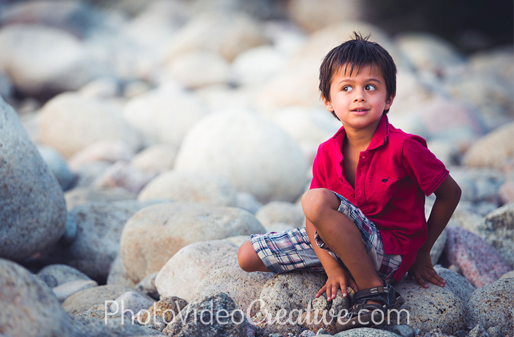
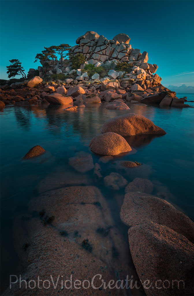
But that’s not enough to make a creative composition. You must be able to combine the counter-intuitive orientation of your photo frame with other composition techniques:
- Wide or tight framing,
- The rule of thirds or the golden ratio,
- The exaggerated or compressed perspective,
- The stacking of foreground, midground, background layers,
- The negative space,
- The lines of force,
- Etc.
These are all composition techniques to consider when deciding between a natural or opposite orientation to your subject. But how do you know which orientation is the better? The best direction should be the one that best expresses your emotions.
A Quick Introduction to the Theory of Emotions
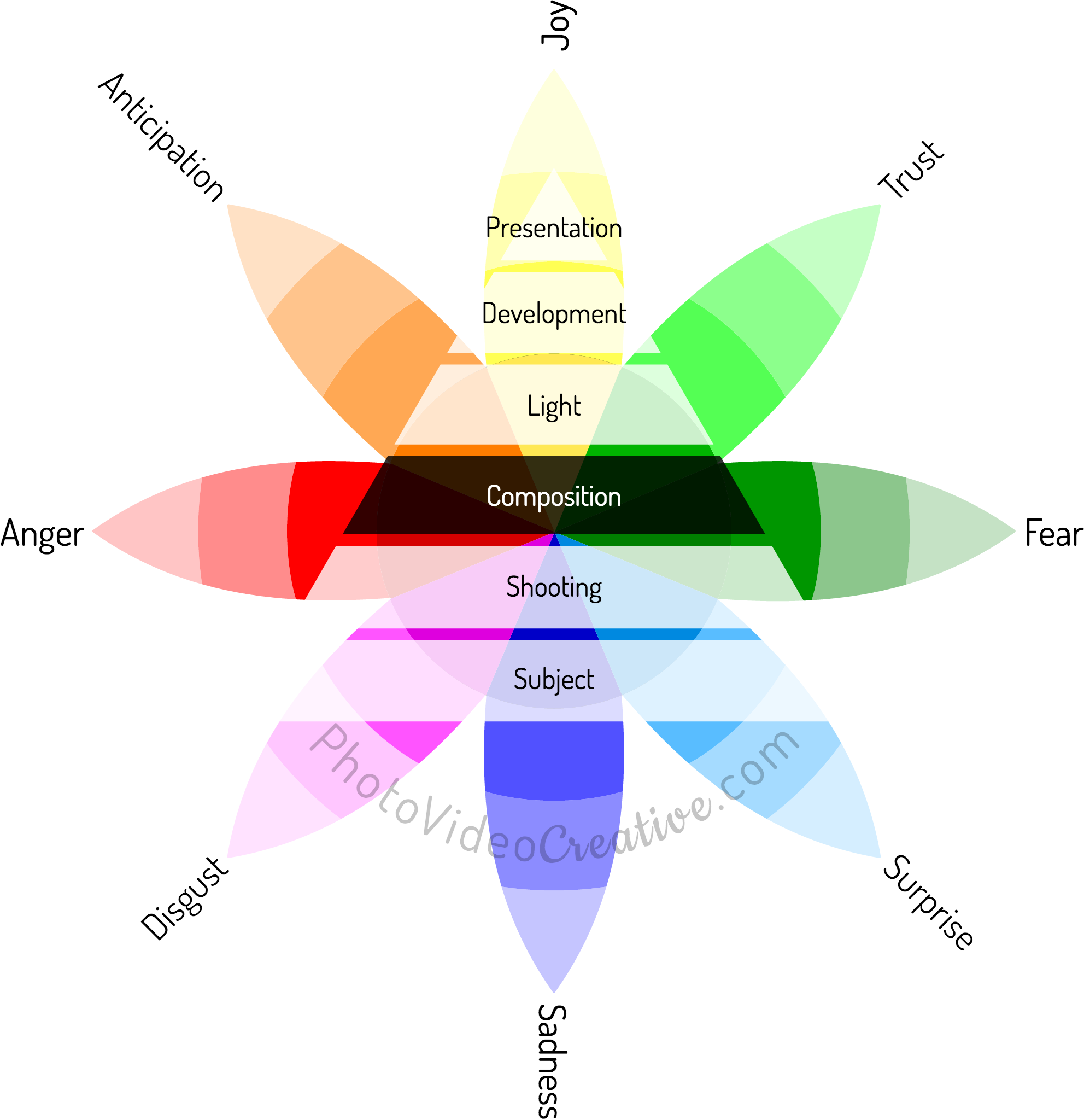
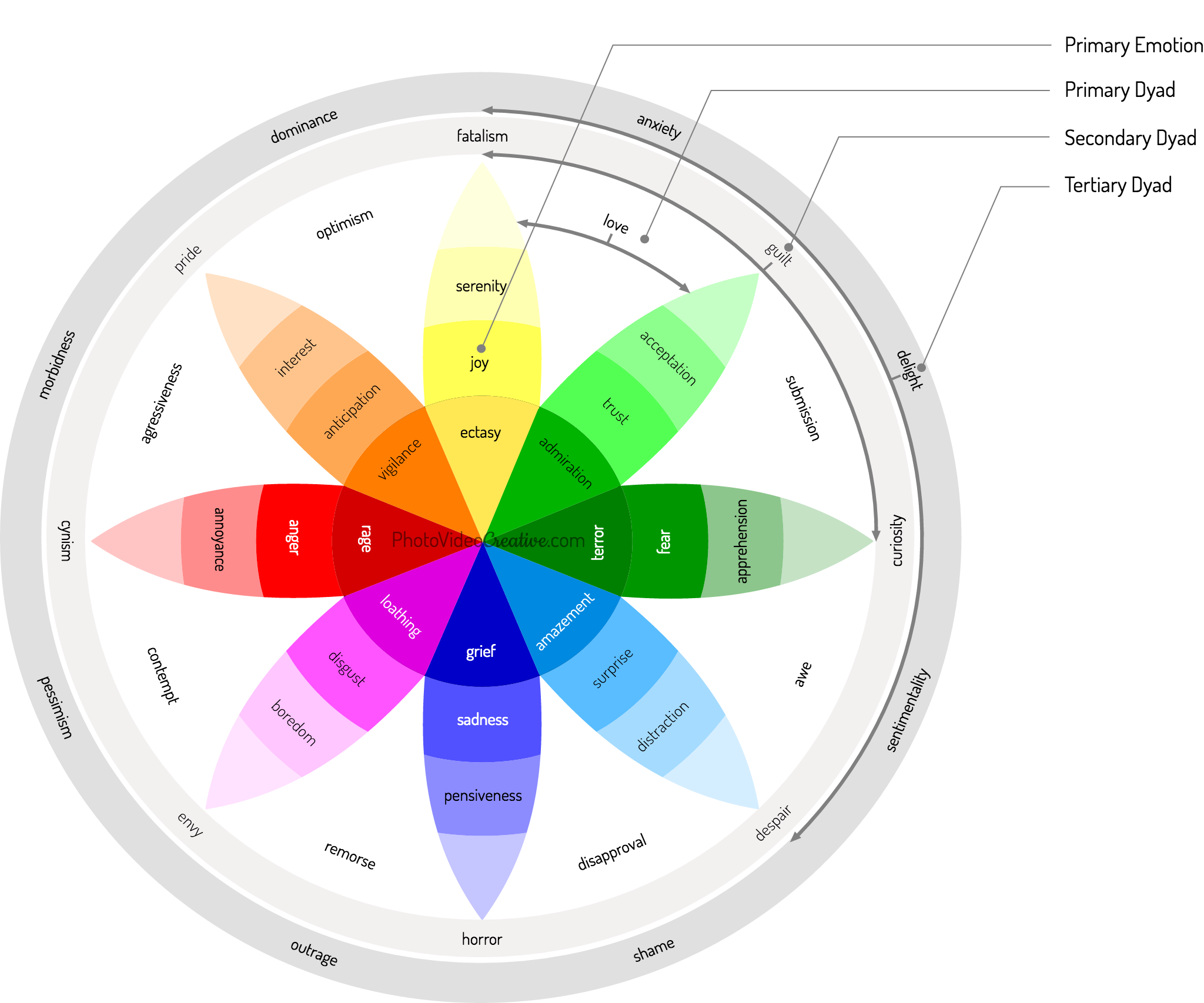
All types of emotions that we feel can be represented on a wheel with 8 primary emotions according to the theory of emotions of Plutchik. These primary emotions come in varying intensities (the most intense are at the center) and combine in 24 other emotions through dyads.
Emotions Related To A Natural Orientation Against The Subject
A natural framing of your photo, that is to say aligned in the same orientation as your subject, is a composition that is neutral for your emotions.
This type of composition will not interfere with what you have already captured: the emotions of the subject, the shot or the light. Emotions are not specially enhanced or diminished.
If you feel that the emotional charge of your photo is already very perceptible, it is surely useless to add any composition technique that needs to be visible at all costs. Sometime is good to apply the good old principles “the best is the enemy of good”, or “less is more”!
Emotions Related To An Opposite Orientation Against The Subject
As explained above, framing your photo opposite to the natural orientation of your subject should be combined with another composition technique to be effective.
The other composition technique becoming even more visible, your photo will benefit from a even stronger emotional effect.
If we look at the emotions wheel above, it means that one or more emotions in the center of the wheel will be accentuated:
- Ecstasy,
- Admiration,
- Terror,
- Amazement,
- Grief,
- Loathing,
- Rage or
- Vigilance.
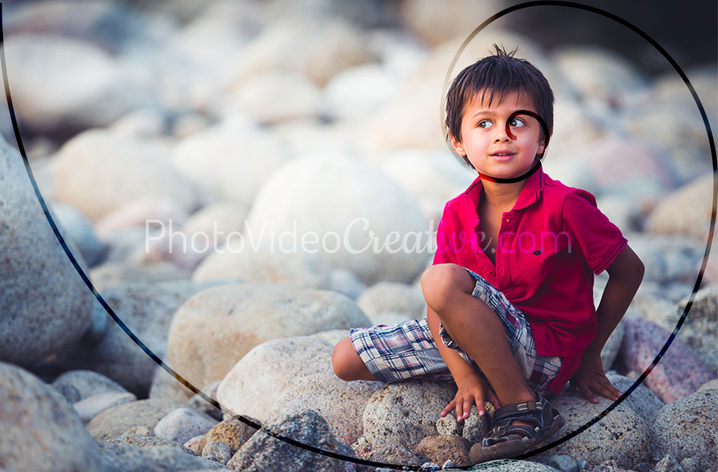
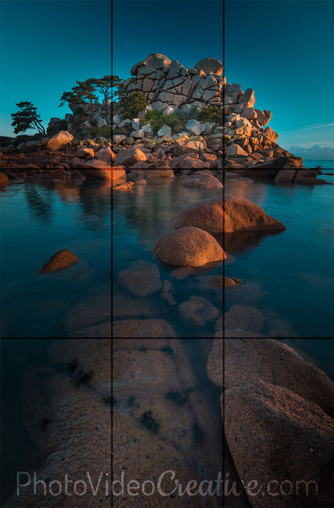
But be careful. If you only take an opposite orientation against your subject without any other form of composition, you will miss your picture. Because the composition will clearly not be natural, instead of enhancing the emotions, you will introduce negative emotions:
What Do You Think?
Were you aware that by going against your natural visual perception, you could reinforce the emotions of your photo? Were your attempts successful to use an opposite orientation to that of the subject? Did you understand what complementary composition technique could have been used to make a better photo?
Leave me your comment, I will answer with pleasure!
Let’s Go On Together!
Learn how to photograph with my 6-step method to make your photos first with your emotions. A powerful and intuitive approach that frees you from tools and techniques.
Then understand why composition in photography is essential in the expression of your emotions and explore these composition techniques:
1. Compositions with the frame:
- Off-center Subject: the Rule of Thirds
- Off-center Subject: the Golden Spiral (coming soon)
- Tight Framing, Wide Framing
- Portrait Orientation, Landscape Orientation (this post)
- Square, Academic and Panoramic Aspect Ratio
2. Compositions in space that play on the orientation, the depth and the volume of the subject:
- High Camera Angle, Low Camera Angle
- Exaggerated Perspective, Compressed Perspective (coming soon)
- Foreground, Midground and Background Stacking (coming soon)
3. Compositions with the content:
- Guideline and Line of Force (coming soon)
- Void and Negative Space (coming soon)
- Compositions with Contrast: Tone, Color, Shape and Patterns (coming soon)
You can also find practical composition tips with your smartphone.
Do not miss my future posts to better capture and share your emotions in picture: subscribe to my newsletter and get a free eBook!
Very interesting article about the Theory of Emotion and photo orientation. As an abstract artist, particularly non-representational painting, I refer this type of painting to the Language of Feelings. I guess all types of art could, to a certain degree, share the same thing.
It is interesting to see the link between the Theory of Emotion with photo orientation. Thank you for sharing the information.
Thanks for your feedback, I really appreciate it.
I never thought about how the orientation of a photo could influence the emotions it evokes. The way you broke down how portrait orientation emphasizes the subject and creates a more intimate feel, versus landscape providing a broader context, was insightful. It’s fascinating how something as simple as composition can completely change the mood of a photo. Do you think this concept applies equally to other forms of visual art, like painting or digital illustrations? I’d love to hear your thoughts on how artists can use orientation to enhance the emotional impact of their work.